

 by
by In the late ’90s and early 2000s, the internet as we know it today started to become mainstream. Surfing the web became more accessible, and during that time, we witnessed the birth of countless websites, many of them chaotic.
So, what happened to those wild websites? What contributed to the shift? While limited technology was definitely a key factor behind the poor design quality of that era, the lack of design patterns also played a huge role in the messy layouts, and let’s not even get started on the accessibility issues.
As the internet became more popular, the need to deliver better user experiences grew, and so did the demand for visual consistency and planning. That’s when Design Systems started to gain traction in web development, gradually reshaping the way websites look and feel.
Design Systems what?
In a nutshell, a Design System is a collection of reusable UI components and guidelines that help ensure a consistent user experience across an application. But it’s not just about how things look, a good Design System also defines the standard behaviors found throughout the product.
Why it’s important
You might think a Design System is just about making things look pretty, or that it’s not worth the effort to create or follow one. But its importance goes far beyond aesthetics, and I’ll show you why.
Imagine you and a colleague are working together on a web app. You both have different ideas of how it should look and function, but you agree that building a Design System would be a waste of time. So, you skip it and dive straight into the project.
At first, things move along fine. But as the app grows, your team hires another developer to help out. That’s when the problems start.
The first challenge? Onboarding. Without documentation or guidelines, getting up to speed takes way longer than it should.
Next, the new developer starts to notice inconsistencies throughout the app.
Half the form submission buttons look like the "Example 1" in the image bellow, and the other half look like the "Example 2".
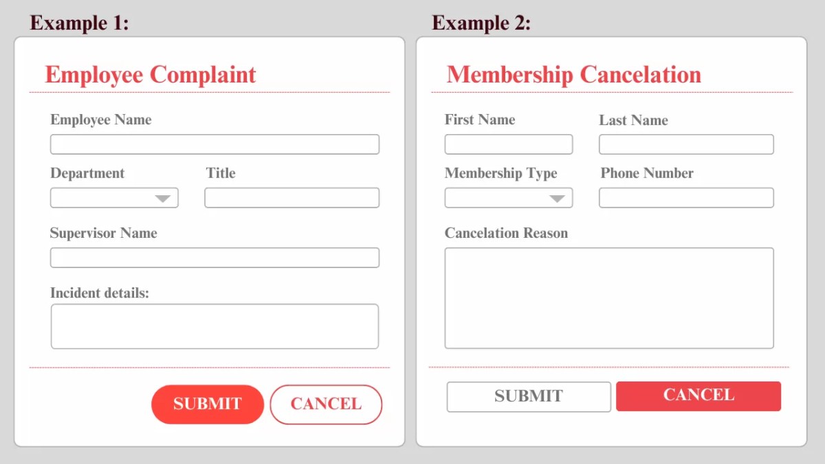 Example of inconsistent button styling across forms
Besides the confusion for the developer, who now has to guess which version to follow, there’s also a real risk of confusing the user. In one version, the “Cancel” button is red and the “Submit” button is white; in the other, those colors are reversed. Without consistency, users might end up clicking “Cancel” when they actually meant to “Submit”, which is frustrating and could lead to real mistakes.
Accessibility is another issue. On the same website, we can see examples of clickable buttons and static badges that look nearly identical. Check the next image.

That kind of inconsistency can confuse users and make the interface less intuitive, especially for people using assistive technologies.
So here’s the thing: a well-defined Design System doesn’t just make your UI look polished. It speeds up development, improves onboarding, scales better as your team grows, supports accessibility, and, most importantly, creates a more fluid and trustworthy experience for your users.
Components of a design system
Now that you understand the importance of having a Design System, it’s time to look at what makes a good one. We can break it down into four main pillars:

Component Library
This is the developer’s toolbox. It includes reusable UI components like inputs, buttons, modals, badges, cards, etc. These elements work together to create intuitive and cohesive user experiences.
A great UI component should be as agnostic as possible. Reusability is key; it makes the codebase easier to maintain and much more scalable as the project grows. Libraries like React provide powerful tools for building these reusable components across different parts of an application.
Style Guide
This is the visual language of the product. It includes colors, typography, icons, logos, brand guidelines, and even illustrations. It can also include the overall tone and mood of the product.
Usage Guidelines
Even with a solid Component Library and a consistent Style Guide developers still need to know when and how to use them. Guidelines help with things like choosing the right button variant, handling states like loading, errors, and disabled, and following accessibility standards.
Documentation
A good Design System isn’t just a collection of components; those need to be paired with detailed documentation. This can include live component previews, code snippets, a list of dos and don’ts, etc. Documentation is what makes developers spend less time guessing and more time building.
With these four pillars, you can build a Design System that gives you a ready-to-use component toolbox, a way to avoid inconsistency bugs, and a huge boost in development speed and product quality.
Wrapping It Up
So, next time you’re about to jump into a new project thinking “we’ll figure it out as we go,” remember this: investing time into a Design System is more than worth it. It is a foundation for building better, faster, and more consistent digital products. Whether you’re part of a small dev team or working at scale, having clear standards, reusable components, and accessible patterns helps everyone stay on the same page.
Start small, keep it consistent, and watch your product (and your sanity) thank you later.
References
- Design system 101: What is a design system?
- Understanding Design Systems and Patterns
- Everything you need to know about Design Systems
We want to work with you. Check out our Services page!

